![]()
![]()
| Related Topics: | ||
You can use the Function Wizard to generate many different types of results in an analysis workbook or general spreadsheet. This section provides an example that shows how you can generate custom reports from your data. In this case, you will use Weibull++ to compare the failure time distributions from different tests of a component.
The data sets used in this example are available in the example database installed with the Weibull++ software (called "Weibull9_Examples.rsgz9"). To access this database file, choose File > Help, click Open Examples Folder, then browse for the file in the Weibull sub-folder. The name of the project is "Standard - Overlay Plot."
Note: This example uses the Weibull++ software, but a similar process can be used to generate custom analyzes in ALTA, RGA and BlockSim.
Add an analysis workbook to the project (Insert > Reports and Plots > Analysis Workbook) and select the first data source, which is the “Test 1” data sheet for Component 1.
![]()
Click the Associate Data Source icon and assign the second data source, the “Test 2” data sheet for Component 1.
![]()
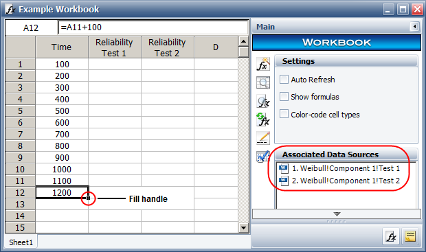
Update the column headings in the report: Time in column A, Reliability Test 1 in column B and Reliability Test 2 in column C.
In cell A1, enter the first time value (100). In cell A2, use the formula =A1+100 to increment the time value used in that cell. Then select cell A2 and drag the fill handle to cell A12 to copy the same function into the rest of the cells in the column.
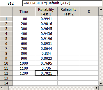
Select cell B1 and open the Function Wizard. Select the RELIABILITY function, use a relative reference to cell A1 for the Age value and select the first associated data source.
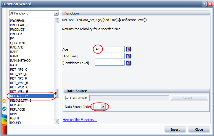
Insert the function into cell B1. Then drag the fill handle to cell B12 to copy the same function into the rest of the cells.
Select cell C1 and open the Function Wizard. Select the RELIABILITY function, use a relative reference to cell A1 for the Age value and select the second associated data source.
Insert the function into cell C1. Then drag the fill handle to cell C12.
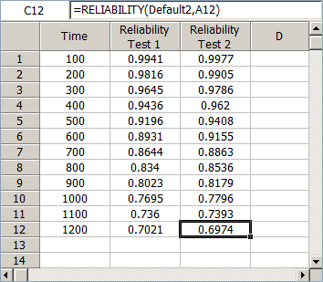
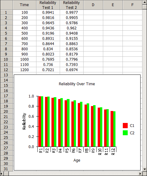
By looking at the data in the table you can see which design has the better reliability at a given time.
You can also add custom charts to the report using the Chart Wizard. For example, to add a bar chart that shows a comparison of the reliability values over time, do the following:
Select the cells in the "Reliability Test 1" and "Reliability Test 2" columns and then choose Sheet > Sheet Actions > Chart Wizard.
Click inside the worksheet and drag to select the area under the data to insert the chart.
In the Gallery window, select the Bar option, then click Next and follow the wizard to add titles. When you are done, the report will look like this:
© 1992-2015. ReliaSoft Corporation. ALL RIGHTS RESERVED.