![]()
![]()
| Related Topics: | ||
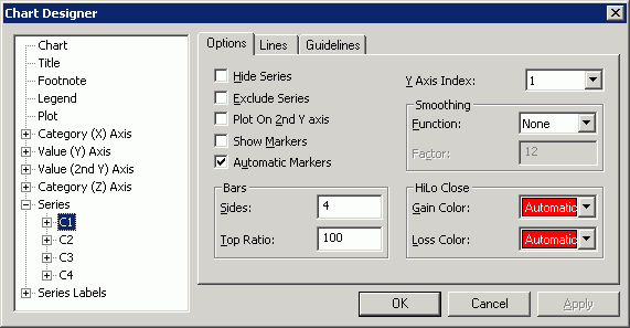
The Options page allows you to customize display options for selected element(s). This page applies to the following chart elements: Series.

Hide Series if selected, turns off the display of the selected series. The space occupied by the series is still shown on the chart, but the data is not displayed. Clear this box to redisplay a hidden series. In pie and doughnut charts, room is still reserved for hidden series pie slices, even though they are not displayed.
Exclude Series if selected, a series is removed from a chart. The data is not displayed and the space occupied by the series is removed from the chart. Clear this box to return an excluded series to the chart.
Plot On 2nd Y Axis if selected, the current series is plotted on the secondary y axis instead of the primary axis. You may then want to change the scale, type or format of the secondary axis to best display the series data. Clear this box to plot the data on the primary axis.
Show Markers displays the markers on the currently selected series. Clear this box to remove markers from the selected series. This option is synchronized with the Show Markers check box in the Markers page and can later be reversed at the datapoint level.
Automatic Markers if selected, a marker is automatically assigned to all non-custom data points in a series. A non-custom data point is any data point that has no custom attributes. Clear this box to select your own choice of marker. Specifying a custom data point marker for your series at a later time will also clear this box in the page.
Smoothing
Function allows you to select a smoothing type.
None indicates no smoothing is applied to the data.
Quadratic B-Spline indicates quadratic B-spline is used for smoothing the data. This form results in a less smooth curve that stays closer to the data points.
Cubic B-Spline indicates cubic B-spline is used for smoothing the data. This form results in a smoother curve, but varies further from the data point than the quadratic B-spline curve.
Factor allows you to specify the number of facets or points sampled between the chart data points to create the smoothing effect. The higher the number, the more smoothing occurs.
Bars
Sides allows you to enter a value between 1 and 360 to indicate the number of sides for the bars.
Top Ratio allows you to enter a number between 0 and 10,000 to indicate the percent of the bottom diameter used to draw the top of the chart. Values less than 100 result in a top smaller than the bottom. Values greater than 100 result in the top wider than the bottom.
Hi Lo Close
Gain Color displays the Color Palette and allows you to select the color used to indicate a gain in value. Select a predefined color or click Custom to mix your own color. Select Automatic to cause all elements that reflect a gain in value to use the fill color defined for the series.
Loss Color displays the Color Palette and allows you to select the color used to indicate a loss in value. Select a predefined color or click Custom to mix your own color. Select Automatic to cause all elements that reflect a loss in value to use the fill color defined for the series.
©2000-2014. ReliaSoft Corporation. ALL RIGHTS RESERVED.