
The block style settings can be defined at the diagram level in the Diagram Style window or at the block level in the Block Style window. The block-specific settings defined in the Block Style window have priority over the default settings defined in the Diagram Style window for the diagram you are working with. For details on how the diagram-level and connector-level settings relate to each other, see Appearance Settings.
Diagram Level
To open the Diagram Style window, right-click the diagram (not blocks) and choose Diagram Style.
Block Level
To open the Block Style window, select one or more blocks, right-click one of the blocks then choose Block Style.
Note that if you are using the this window, you must clear the various Use Default check boxes in order to modify some settings.
Shape and shadow: The options available in the Shape drop-down list depend on the block type. You can change the shape of standard blocks in RBDs, events in fault trees and all blocks in process flow and cause/effect diagrams; all other block types have permanently assigned shapes. You can add a shadow to any available shape.
Size: Unlike the other options on this page, changes to this setting made at the diagram level will apply only to blocks subsequently added to the diagram.
Color and style: The background color is the underlying color applied to the block; the fill color is applied over the background color in the pattern specified by the fill style.
The caption text comes from a block name in BlockSim/RENO, folio name in Weibull++/ALTA or property name in XFMEA/RCM++/RBI.
Location and Horizontal Alignment: Specify where the caption will be displayed (e.g., under the block, inside the block, etc.) and whether it will be left aligned, center aligned or right aligned.
If you choose to place the caption to the left, right or inside the block, you can also specify the Vertical Alignment (i.e., at the top, center or bottom of the block).
If you choose to hide the caption, the Alignment fields will not be available.
The width and height of the area used for the text. You can enter a fixed value for either or both of these. If Block Width is selected in the Width field, the caption text will wrap, if necessary, up to the vertical limit set in the Height field. If Auto Height is selected in the Height field, no limit is placed on the height of the text area.
The color and font used for the text.
These properties are available for BlockSim/RENO blocks only.
The description box displays the text entered in the Description field of the Block Properties window.

Box width and height: You can enter a fixed value for either or both of these or you can set them to be the same as the settings used for the caption area.
If Block Width is selected in the Width field, the description text will wrap, if necessary, up to the vertical limit set in the Height field.
If Auto Height is selected in the Height field, no limit is placed on the height of the text area.
Box color and style: The background color is the underlying color applied to the description box; the fill color is applied over the background color in the pattern specified by the fill style.
Text Location and Horizontal Alignment allow you to specify where the description area will be displayed (i.e., above the block, inside the block or hidden) and whether it will be left aligned, center aligned or right aligned.
If you choose to place the caption inside the block, you can also specify the Vertical Alignment (i.e., at the top, center or bottom of the block).
If you choose to hide the description area, the Alignment fields will not be available.
Note that if you place the description inside the block, only the description text will be shown. The settings for the surrounding area (i.e., background color, fill color and border properties) will not be used. The properties for the background color fill color and fill style of the block will be used instead.
The color and font used for the text.
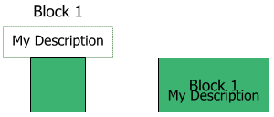
Block captions and descriptions both have the option to place the text above or inside the block. If you choose the same location for both, the description text will display under the caption text.

To load an image:
Clear Use default image, if applicable.
Click Load, and browse for and select the desired image file.
Use the Position drop-down list to specify how the image will be placed on the block (e.g., stretched to fit inside the block's current dimensions, centered, etc.). If you select stretched, you can also define the margins you want.
Select the Transparency Mask Color check box to choose a color that will be shown as transparent when the image is displayed on the block.
Note: If you choose to use an image that is larger than 800x600 pixels, you will be given the option to down sample the image in order to reduce its size and alleviate possible delays related to database size.
Click the Clear button to remove the loaded image and use no image at all.
To use the diagram style settings again, in the Block Style window, choose Diagram Default from the drop-down lists and select the Use Default check boxes.
© 1992-2019. HBM Prenscia Inc. ALL RIGHTS RESERVED.
| E-mail Link |