![]()
![]()
| Related Topics: | ||
![]()
If you keep track of the period in which each returned unit was sold and the period in which it was returned, you can use the Nevada chart format to convert your warranty claims data into failure/suspension data.
The setup window of the Nevada chart format allows you to define the time periods of interest. The value in the Increment field indicates the length of the time period. In the following example, the time unit is in terms of months; therefore, an increment of 1 would mean that 1 period is equivalent to 1 month, while an increment of 2 would mean that 1 period is equivalent to 2 months.
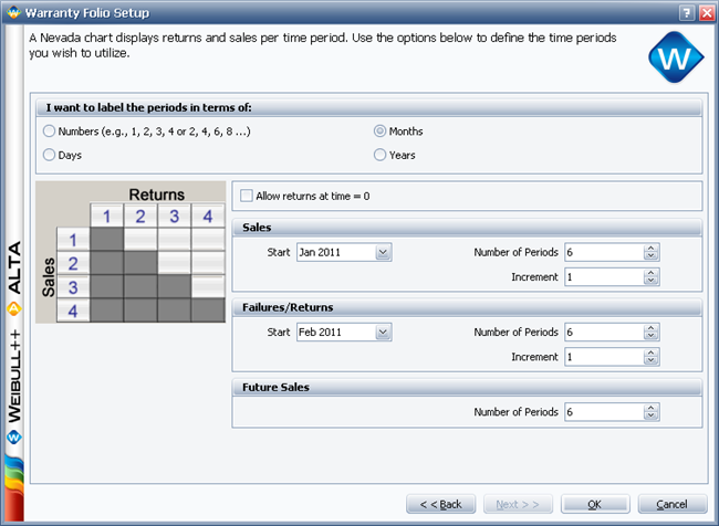
The setup window also includes the following optional settings:
The Future Sales area allows you to define the number of future sales periods. This setting will include additional rows in the Sales data sheet for entering the projected sales figures. Information regarding future sales is used only in the forecast analysis.
Allow Returns at Time = 0 allows you to include zero-time failures in the analysis, which are failures that occurred before the units made it to the field. These failures may be due to manufacturing defects, insufficient quality control or shipping damages.
In the Nevada chart format, selecting a new unit only changes the name of the unit. The data set is not converted to the new unit. The appropriate columns in the data sheet will be automatically configured for the time units you selected, and the new unit will be displayed next to the results in the control panel.
There are two ways you could edit the time periods for an existing Nevada chart data sheet:
If the periods are labeled in terms of days, months or years, you can change the time units and periods anytime by choosing Warranty > Tools > Data Sheet Setup or by clicking the icon on the control panel.
![]()
This opens the Warranty Folio Setup window, which allows you to edit the time periods. Note that when you change the existing setup, you may lose information already entered in the data sheet.
If the periods are labeled in terms of numbers, you can use any time units appropriate for your data. To select a time unit, click the Change Units icon on the Main page of the control panel of the data sheet.
![]()
This opens the Change Units window, which gives you a selection of time units to use. The units that are available in the drop-down list are defined at the database level.
The Nevada chart folio consists of two data sheets: Sales and Returns. The picture shown next is an example of the Sales data sheet.
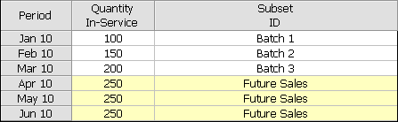
Note: For the column headings in this sheet, the general term in-service represents the closest estimate of the time at which each unit started operating in the field. For example, if you have access to both the manufacturing date and the shipping date for a group of parts, you may choose to perform the analysis based on the shipping date because it is a closer indicator of the time the product started operating in the field.
The Sales data sheet contains the following information:
The Period column shows the time periods that were defined during setup.
The Quantity In-Service column indicates the number of units that are assumed to have started operating during each period.
The Subset ID column is for logging any pertinent information or comments about the data. You can also use the Subset ID column to categorize subpopulations in your data set. You will be able to choose a distribution appropriate for each subset of data by selecting the Use Subsets option on the Main page of the control panel.
Note: The subset ID can be any text up to 30 characters, including spaces. For example, “A _ _ X” is not the same as “A _ X” where “ _ ” is used to designate a space.
If you entered future sales periods during setup, yellow rows will be added in the data sheet to identify the future sales data. The projected sales figures will be used in the forecast analysis.
The picture shown next is an example of the Returns data sheet. The column headers represent the warranty periods and the row headers represent the sales periods.
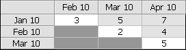
In the example shown here, there were 3 returns in February from the batch that was in-service in January. In March, 5 more units from the batch that was in-service in January were returned and 2 units from the batch that was in-service in February were also returned. The rest of the chart can be read in a similar manner.
To perform the warranty analysis, go to the Main page of the warranty folio control panel and choose a failure distribution for the data set and a parameter estimation method (you can also choose the parameter estimation settings from the Analysis page of the control panel). Click Calculate. Weibull++ automatically converts the warranty data into failure/suspension times and also estimates the parameters of the chosen distribution.
To view the failures/suspension data, click anywhere within the Analysis Summary area of the control panel to open the Results window, which shows the converted failure/suspension data and the parameters of the life distribution model. From the Results window, you can edit, copy or print the results.
© 1992-2015. ReliaSoft Corporation. ALL RIGHTS RESERVED.