
| Related Topics: | ||
The overlaid contour plot displays all of the factor level combinations for two quantitative factors that will produce response values that fall within the user-specified goal. This plot is available for all designs with at least two quantitative factors.
There are three different ways to create an overlaid contour plot:
Choose Insert > Optimizations > Add Optimization.
![]()
In the Select Optimization Tool window that appears, select a folio to optimize and then select to create an overlaid contour plot.
You can create an overlaid contour plot directly from a calculated design folio by clicking the Overlaid Contour Plot icon on the control panel.
![]()
An optimization folio containing an overlaid contour plot for the folio will be added to the Optimizations folder in the current project explorer. If there is an optimization folio already associated with the design folio, clicking the Overlaid Contour Plot icon on the control panel for the design folio will add the overlaid contour plot as a sheet within that folio.
Open an existing optimization folio and add additional optimization tools based on the same design folio by choosing Optimization > Tools > Add Optimization Tool.
Note that each optimization folio can have only one optimization tool of each type.
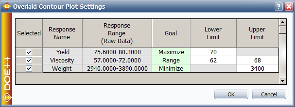
When you first create an overlaid contour plot, you will need to specify the settings that the plot is based on. The Overlaid Contour Plot Settings window will appear automatically. In the Selected column, select the response(s) that you want to optimize.
In the Goal column, specify whether you want to minimize the response, maximize it or get it within a range of values. You will then specify a lower limit and/or an upper limit for the response, depending on which action you have selected.
Note that if a transformation has been applied to any response that you are optimizing, the transformed response values are used in optimization. For this reason, the values that you enter for Lower Limit and/or Upper Limit must also be transformed values. For example, life data responses always have the lognormal transformation applied; therefore, if you are maximizing a life data response, the Lower Limit value should be in terms of Ln(failure time).
Once you have specified the settings, click OK. The overlaid contour plot will be created.
Note: You can specify new settings at any time by clicking the Calculate icon ( ![]() ) to re-open the Overlaid Contour Plot Settings window. You can also change the folio that the overlaid contour plot is based on by clicking the Select Data Source icon (
) to re-open the Overlaid Contour Plot Settings window. You can also change the folio that the overlaid contour plot is based on by clicking the Select Data Source icon ( ![]() ).
).
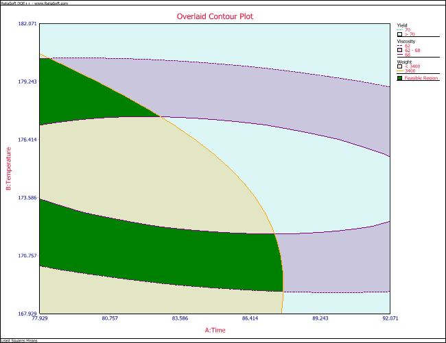
For each response that is included in the plot, a shaded region shows the combinations of factor settings that result in the response values that you specified in the Overlaid Contour Plot Settings window. For example, consider the settings and plot shown next.


In the plot, the area shown in blue represents all of the combinations of factor settings for the time and temperature factors that will cause the yield to be greater than 70. The areas shown in purple represent the factor setting combinations that will result in a viscosity between 62 and 68. The area in beige represents the factor setting combinations that will give a weight of less than 3,400. Where all three of these areas overlap (i.e., the areas shown in green), the factor settings will give desirable values for all three results.
You can specify which factor is shown on each axis using the drop-down lists in the Factors area on the control panel.
The overlaid contour plot looks at the interaction between two factors. If there are more than two factors used in the experiment, the factors that are not shown on the plot axes will be held at a constant value. In the Factor Values area on the control panel, you can choose to use least squares means to determine the value used for each factor or to specify your own custom values. If you select Use Custom Values, then click Set to open the Set Custom Factor Values window and specify the custom values that you want to use. Note that these values will be used only when the factors are not shown on the plot axes. Note that if a response is missing all data at a given level for a qualitative factor or a block (which is essentially a type of qualitative factor), that level cannot be included in the optimization of the response. Therefore, any level you specify that does not have data for a given response will instead be treated as equal to 0 in the optimization of that response.
© 1992-2015. ReliaSoft Corporation. ALL RIGHTS RESERVED.