![]()
![]()
|
|
||
The optimal solution plot provides a graphical analysis of the factor settings that will produce the user-specified optimum value for one or more responses. This plot is available for all designs with at least two factors.
There are three different ways to create an optimal solution plot:
Choose Insert > Designs > Optimization.
![]()
In the Select Optimization Tool window that appears, select a folio to optimize and then select to create an optimal solution plot.
You can create an optimal solution plot directly from a calculated design folio by clicking the Optimization icon on the control panel. An optimization folio containing an optimal solution plot for the folio will be added to the DOE folder in the current project explorer. If there is an optimization folio already associated with the design folio, clicking the Optimization icon on the control panel for the design folio will add the optimal solution plot as a sheet within that folio.
Open an existing optimization folio and add additional optimization tools based on the same design folio by choosing Optimization > Tools > Add Optimization Tool.
Note that each optimization folio can have only one optimization tool of each type.
When you first create an optimal solution plot, you will need to specify the settings that the plot is based on. The Optimization Settings window will appear automatically. The navigation panel on the left of this window lists all of the settings pages.
The pages listed under the Responses heading allow you to select which response(s) you want to optimize, and to specify the optimal settings for each response. The settings on these pages are required in order to create the plot.
 Click here for more information on specifying the response settings.
The pages listed under the Factors heading allow you to select which factors will be varied in the optimization, and to specify boundaries or constraints on any quantitative factors to be used in the optimization process, thereby excluding solutions that call for factor settings outside the range(s) you specify. The factor values are expressed in terms of actual or coded values. To change the setting, close the Optimization Settings window and choose Plot > Display > [Value Type].
Click here for more information on specifying the factor settings.
The pages listed under the Algorithm heading allow you to specify how the optimization calculations are performed.
Click here for more information on specifying the calculation settings.
The Summary page allows you to review all your optimization settings.
Once you have specified and reviewed the settings, click OK. The software will compute up to five optimal solutions (i.e., the combinations of factor settings that will produce the most desirable response values, based on your specifications in the Optimization Settings window) and will create a plot of the first optimal solution. Other solutions will be displayed in the Solutions area of the control panel; click a solution to view its plot. Note that the order in which the solutions are displayed is random and does not indicate their desirability.
Note: You can specify new settings and re-compute the optimal solutions at any time by clicking the Calculate icon ( ![]() ) to re-open the Optimization Settings window. You can also change the folio that the optimal solution plot is based on by clicking the Select Data Source icon (
) to re-open the Optimization Settings window. You can also change the folio that the optimal solution plot is based on by clicking the Select Data Source icon ( ![]() ).
).
In the plot of a solution, each response selected for inclusion is presented in a separate row and each factor selected for inclusion is presented in a separate column. In addition, a column can be displayed for blocks. By default, the response value is marked with a blue dashed line and the factor settings that yield that response value are marked with red dashed lines. For example, in the plot shown next, the response is being maximized, with a target value of 4.5 or greater. Three factors are included in the optimization. In this solution, the actual response value of 4.826 is achieved by setting factor A (a qualitative factor) to "copper," factor C (a quantitative factor) to 36.000 and factor E (a qualitative factor) to "new."
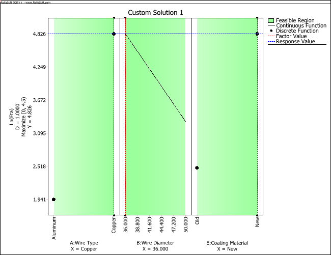
As you can see, possible settings for qualitative factors (and blocks) are displayed as points, while possible settings for quantitative factors are displayed as lines. To change the responses and/or factors that are shown in the plot, click the Select Responses & Factors icon.
![]()
In addition, you can choose to display the feasible region for the factor settings (i.e., the region between the limits specified in the Optimization Settings window) by selecting the Display Feasible Region check box on the control panel. In the plot shown here, the feasible region is indicated by green shading, where reduced desirability is indicated by lighter shading.
You can create your own custom solutions by clicking the Create Solution icon ( ![]() ) in the Solutions area on the control panel. In the window that appears, enter a name for the solution and specify the factor values to be used for the solution. Your new solution will be added to the solutions list.
) in the Solutions area on the control panel. In the window that appears, enter a name for the solution and specify the factor values to be used for the solution. Your new solution will be added to the solutions list.
Custom solutions can be edited by selecting the solution in the list and clicking the Edit Solution icon ( ![]() ) or by dragging the factor lines directly on the plot. Note that if you edit an optimal solution generated by the software, your changes will be used to create a new custom solution and the original solution will remain unchanged. You can also duplicate a solution by selecting the solution and clicking the Duplicate Solution icon (
) or by dragging the factor lines directly on the plot. Note that if you edit an optimal solution generated by the software, your changes will be used to create a new custom solution and the original solution will remain unchanged. You can also duplicate a solution by selecting the solution and clicking the Duplicate Solution icon ( ![]() ).
).
To remove a solution from the solutions list, select the solution and click the Delete Solution icon ( ![]() ). This cannot be undone.
). This cannot be undone.
You can view all of the optimal and custom solutions in a numeric format by clicking the View Solutions icon ( ![]() ). The Solutions window shows each solution, including factor settings, the associated block (if any) and the predicted response(s) at those settings. The response desirability columns rate the desirability of each solution from the perspective of optimizing each response. If more than one solution has been optimized, the global desirability column rates the overall desirability of each solution (i.e. how well its relative optimization of each response meets the requirements specified by the Weight and Importance settings on the Response Settings tab of the Optimization Settings window).
). The Solutions window shows each solution, including factor settings, the associated block (if any) and the predicted response(s) at those settings. The response desirability columns rate the desirability of each solution from the perspective of optimizing each response. If more than one solution has been optimized, the global desirability column rates the overall desirability of each solution (i.e. how well its relative optimization of each response meets the requirements specified by the Weight and Importance settings on the Response Settings tab of the Optimization Settings window).
The Transfer Solution to Overlaid icon ( ![]() ) creates an overlaid contour plot using the factor values in the currently selected solution.
) creates an overlaid contour plot using the factor values in the currently selected solution.
Note: If the optimization is based on a reliability DOE analysis, the Publish Model button will be available on the control panel. When you click this button, the selected solution will be used to publish the analysis results as a model. (See Publishing Models from R-DOE.)
© 1992-2017. HBM Prenscia Inc. ALL RIGHTS RESERVED.
 |
E-mail Link |
